

When did data enter mankind’s history? If you would ask an archaeologist or a historian, he might answer: About 35.000 years ago, with cave paintings. The reason why they are being held as data points to their symbolic dimension: Cave paintings may be not mere representations of what has been observed by the people who produced these drawings, but because they may have been designed for religious or ceremonial purpose. Depictions of men dancing around a slayed animal can thus be interpreted not only as human beings performing a spontaneous dance of victory, but they can also be seen as illustrations of rituals and cosmologies. Sacred knowledge written on ceilings of locations not inhabited by men.
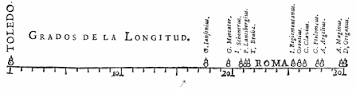
Statisticians (and data scientists) see these things differently. For them, data are clearly bound to abstract signs. In spite of the much older presence of hieroglyphs – this peculiar Egyptian mixture of pictograms and abstractions –, they would point to Phoenician letters providing recipes of beer, with numbers provided for amounts of barley; or to Sumerian calculations scratched into wet clay, which has been burned subsequently and preserved as ostraca. Knowledge about intoxicating beverages and bargaining. Data, in this understanding, is connected to numerical values and not to the symbolic values which make up the surplus of the cave paintings. Moreover: While figurative drawings found in caves are visualizations in themselves, a ‘modern’ understanding of data points to maps as the beginning of data visualization (400 BC), star charts (150 BC), and a mechanical knowledge diagram drawn in Spain in 1305. Knowledge about the world and about knowledge itself. Canadian researcher Michael Friendly, who charted the history of data visualization in his Milestones project, sees Michael Florent van Langren’s 1644 representation of longitudes as the first (known) statistical graph.
We see here not only differing conceptions of data, but of what a visualization of data might be. And, if we follow the traces laid out by people writing on the history of data visualization (like Michael Friendly, Edward Tufte or Daniel Rosenberg), we soon note that there seems not to be a straightforward evolution in data visualization. On the one hand, data visualization depended on the possibilities painters and printers provided for data specialists; on the other hand, the development of abstract thinking took its own routes. The indices and registers found as annexes in printed books form the data basis for networks of persons or conceptions, but their visualization came later. Visualizations became more common in the 19th century (John Snow’s map of cholera-contaminated London is one of the more popular examples here), and data visualization was taken out of the hands of the experts (who paid the graphic designers and could afford costly printing) only in the 20th century, with mass distributions of excel and power point. A new phase started with the Internet providing libraries for visualization like D3.js or P5.js. But these different phases also point to what Foucault had written in his “archéologie du savoir” – when history shifted from one view to another, the past became virtually incomprehensible to the present. Visualizations become outdated and are no longer easy to understand. Thus, returning to our starting point: Are cave paintings not simply other visualizations of data and knowledge than Phoenician beer recipes? Is it a failure of different disciplines not to be able to find an agreement about what terms like ‘knowledge’ and ‘data’ mean? Doesn’t our conception of ‘knowledge’ and ‘data’ determine what is being termed ‘visualization’?

One thought on “Data and their visualization”